Can a sign-up illustration reduce logins and registrations?
Author: Ali Abouelatta
Tags: signup, onboarding, conversion, illustration
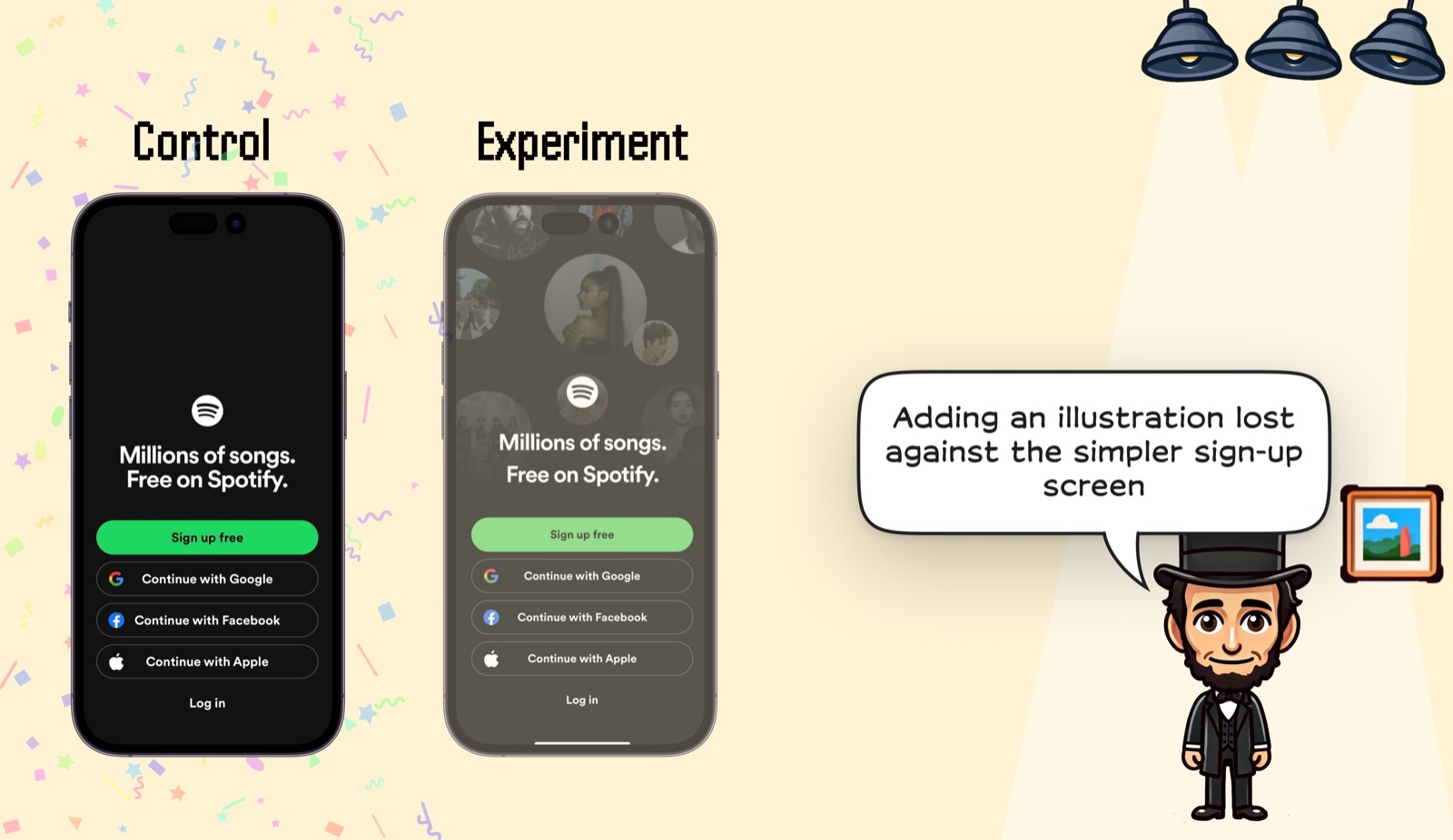
Short answer: Yes. Ali's Spotify example shows that even adding an illustration to an otherwise plain signup screen lost against the simpler control. The change did not add a new decision, but it added visual competition around the same signup, social-login, and login actions.
Evidence
The Spotify visual isolates a smaller change than the video tests: a plain black signup control against a similar screen with illustrated background portraits.
What changed
- Control: black Spotify signup screen with a clear green primary CTA and social login options.
- Experiment: similar layout with added illustration behind the Spotify mark and headline.
- The experiment changed visual emphasis without improving the action set.
Why it matters
- Delight does not have to be heavy to distract; a simple illustration can be enough.
- Signup screens should earn every decorative element against the cost of weaker action clarity.
Sources
- [1] Lazyweb Research: Spotify signup illustration test. Ali says the Spotify example shows that adding an illustration to an otherwise plain signup screen hurt logins and registrations. Source