What did Ring learn from testing a boring sign-up screen?
Author: Ali Abouelatta
Tags: signup, onboarding, conversion, video
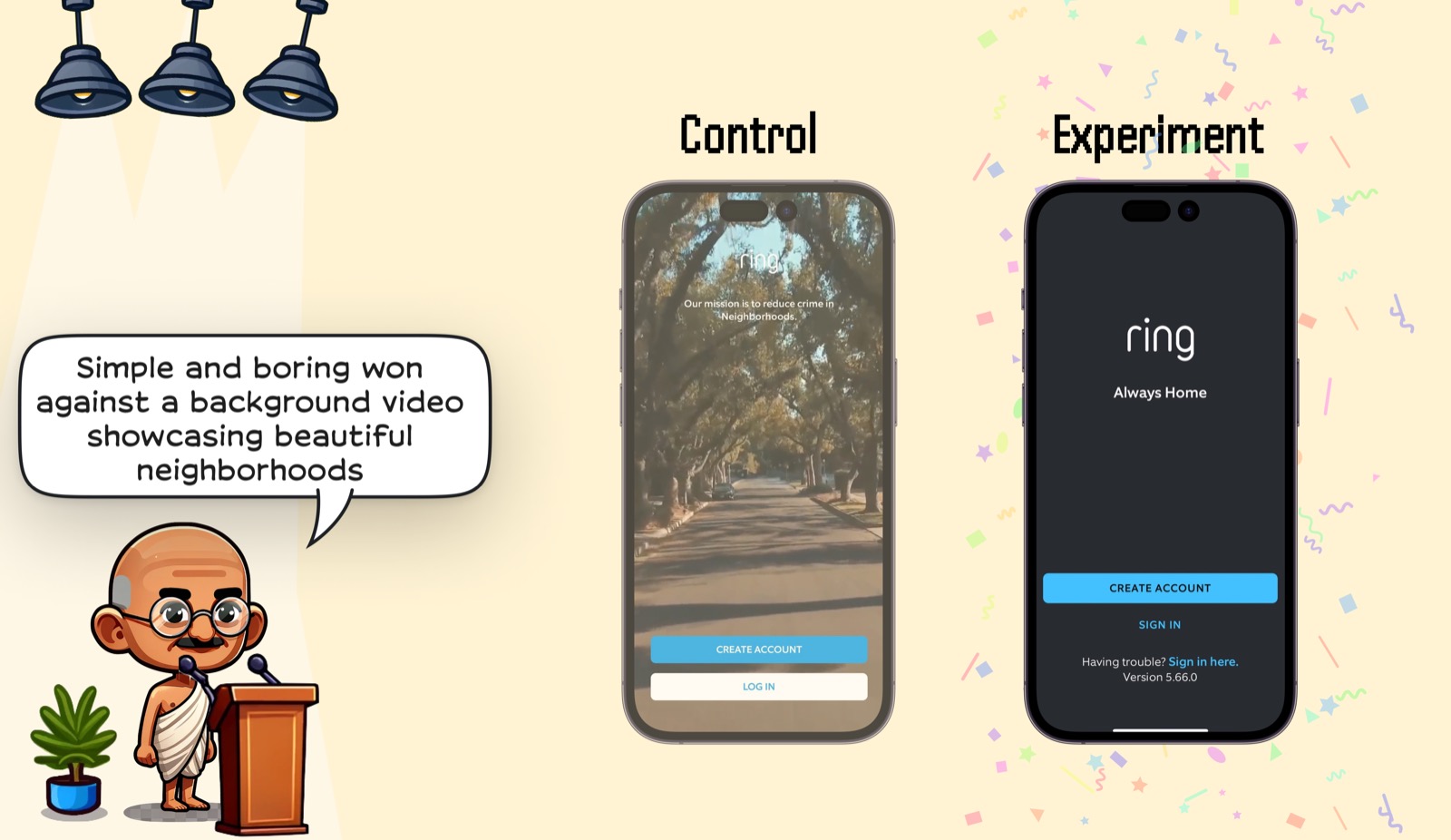
Short answer: Ring's functional signup screen beat a more delightful signup experience with a neighborhood background video. The winning version stripped the screen back to logo, promise, create-account CTA, sign-in link, and support copy, reducing competition around the primary action.
Evidence
The Ring visual is a control/experiment comparison: the control uses a background neighborhood video, while the experiment uses a plain dark screen centered on account creation.
What changed
- Control: background video plus Ring mission copy over the video.
- Experiment: static dark screen with the Ring logo, short promise, primary CTA, and sign-in link.
- The experiment removed the moving neighborhood scene from the conversion moment.
Why it matters
- A mission-oriented visual can still distract when the user is trying to create an account.
- Plain signup screens can make the CTA easier to parse and tap.
Sources
- [1] Lazyweb Research: Ring signup-screen experiment. The Ring example shows a simple signup screen winning against a background video showcasing neighborhoods. Source