What did Nextdoor learn from testing a boring sign-up screen?
Author: Ali Abouelatta
Tags: signup, onboarding, conversion, video
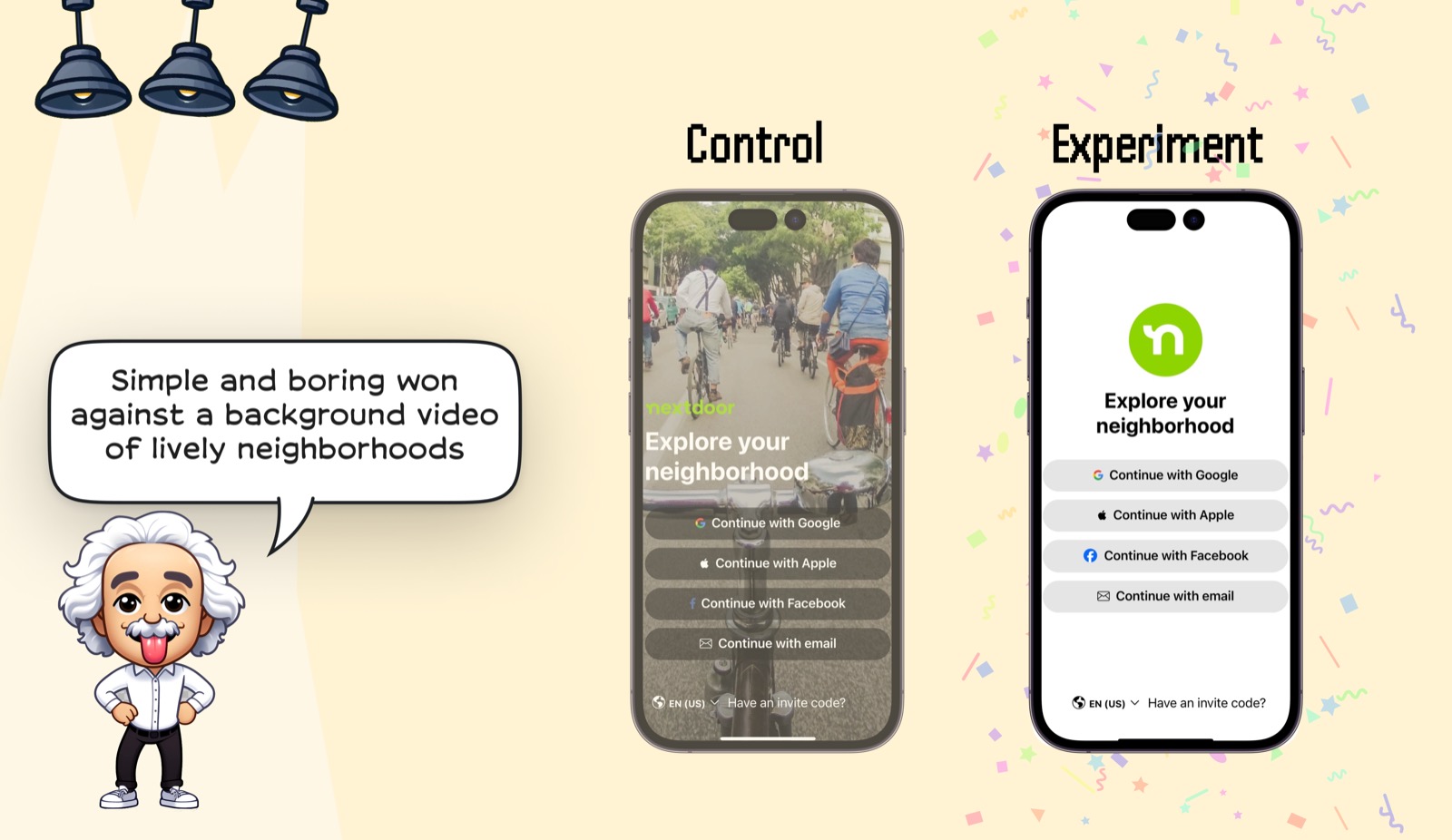
Short answer: Nextdoor's plain white signup screen beat a background-video version built around lively neighborhood footage. The winning version kept the neighborhood promise but removed the moving scene, making the sign-in methods and invite-code path more prominent.
Evidence
The Nextdoor visual shows the same acquisition goal with two treatments: a brand-story video control and a static white experiment with clearly separated login choices.
What changed
- Control: lively neighborhood video behind the signup choices.
- Experiment: white background, large Nextdoor mark, headline, and stacked auth buttons.
- The experiment preserved the neighborhood concept while removing motion and visual noise.
Why it matters
- A community product does not need to prove community with video at the signup step.
- Removing visual noise can make secondary paths, like invite codes, easier to notice.
Sources
- [1] Lazyweb Research: Nextdoor signup-screen experiment. The Nextdoor example shows a simple signup screen winning against a background video of lively neighborhoods. Source