Why should sign-up screens be boring?
Author: Ali Abouelatta
Tags: signup, onboarding, conversion, functional design
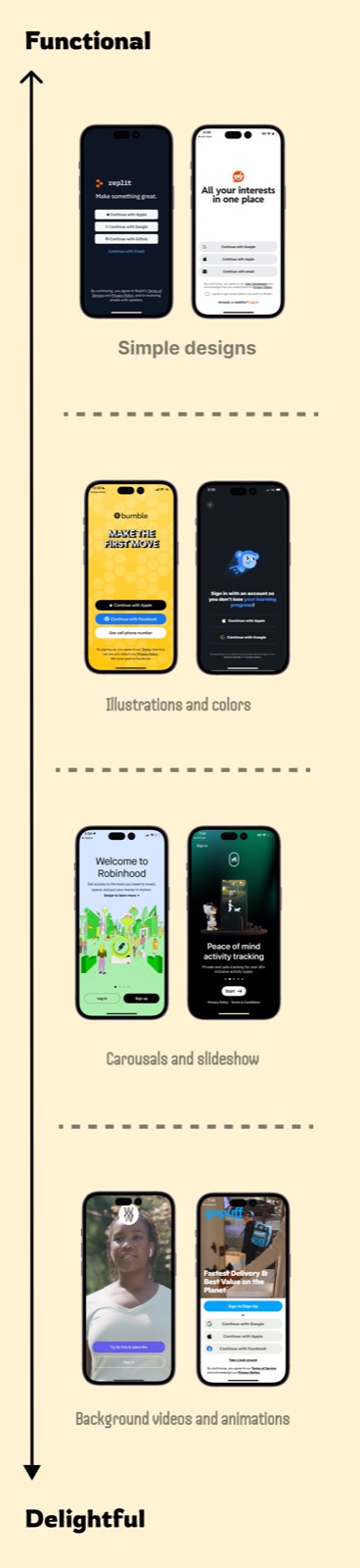
Short answer: Ali's review of Ring, AllTrails, Nextdoor, and Spotify signup redesigns found the functional, plain version won in each case. The pattern is that signup is a job-to-be-done moment: decorative videos, illustrations, and animation can distract from the CTA and can add download or bandwidth cost.
Evidence
The source frames signup design as a functionality-versus-delight tradeoff, then shows four experiments where simpler UI beat more emotionally expressive signup screens.
What changed
- Ring, AllTrails, and Nextdoor tested plain signup screens against background-video experiences.
- Spotify tested a simple signup screen against a version with added illustration.
- The functional versions focused attention on account creation and login actions.
Why it matters
- Signup is a conversion step, so visual delight can become attention competition.
- Heavy media can increase app size and bandwidth requirements, which matters for users on slower networks.
Sources
- [1] Lazyweb Research: boring signup screens. Ali reviews four recent signup-screen redesigns across Ring, AllTrails, Nextdoor, and Spotify and says functional, boring designs won in each experiment. Source